

Colors in Japanese Art by Nobuyoshi Hamada invites readers into the captivating world of Japanese colour traditions, where every hue tells a story centuries in the making.
This masterful exploration reveals how colour transcends mere decoration in Japanese art, from the symbolic importance of seasonal kimono choices to the carefully curated palettes of ancient pottery and prints.
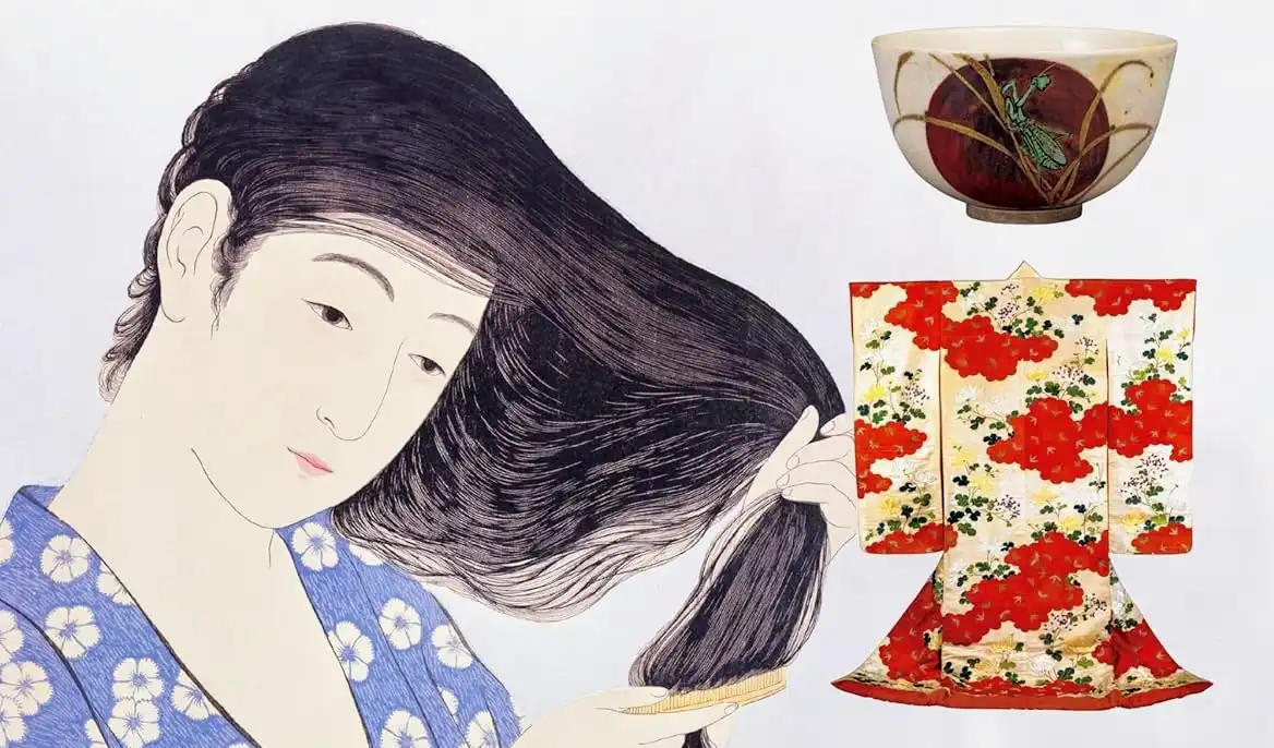
With over 120 stunning examples and detailed colour analysis, the book offers an unprecedented journey through Japan’s artistic heritage, making it an essential guide for art enthusiasts and colour devotees alike.
I asked colour consultant and artist Lauren Battistini to cast her expert eye over the book, here’s her review…
Key Takeaways
Colour is a language: In Japanese art, colour is more than just decoration; it’s a “silent language.” Specific colours and combinations convey deep cultural and social meanings, indicating everything from the wearer’s social status to the season.
A comprehensive guide: The book is an exhaustive resource, featuring over 120 examples from various art forms like kimonos, pottery, and prints. It provides a detailed analysis of each colour, its historical context, and its cultural significance.
An invaluable resource for creatives: Reviewer Lauren, a colour consultant and artist, praises the book’s practical value. The glossary of colors and their codes, along with explanations of traditional colour combinations, makes it an essential tool for anyone working with colour.
Meticulously organised: The book is thoughtfully structured by hue, with dedicated sections for each major colour family (red, purple, blue, etc.). It also delves into special topics, such as layered colour schemes and the origins of colour names from nature.
A must-read for Japanophiles: Lauren highly recommends the book for anyone with an interest in Japanese art, history, and culture. It’s not just an academic text but an enjoyable and insightful read that unlocks a deeper understanding of Japanese aesthetics.
Listen to the podcast ►
Want More Free Content Like This?
- Key Takeaways
- Japan Holds a Special Place in my Heart
- A Glossary of Colours As a Helpful Resource
- How Colour Names Were Derived
- An Essential Read for Any Student of Colour
- An Unexpected Surprise
- A Rich Journey into Colour in Japanese Culture and Society
- Conclusions on Colors in Japanese Art
- Colors in Japanese Art Book Facts and Figures
- About the Author
- Leave A Comment / Ask A Question
- I'm Rob, and I've been where you are
- Benefits You Can Choose
- What Clients Say
- How It Works
- Ways I Can Help You With Concierge
- Ready to Get Started?
- RESOURCES

Colors in Japanese Art Book Reviewby Lauren Battistini
As a certified architectural color consultant and emerging artist, I was delighted at the prospect of reviewing the recently published book Colors in Japanese Art by Nobuyoshi Hamada. Many thanks are in order to both Rob Dyer of The Real Japan and Tuttle Publishing House for this opportunity, and of course to the author Hamada-san.
 Buy Colors in Japanese Art on Amazon
Japan Holds a Special Place in my Heart
Japan as a country and its people hold a very special place in my heart, as my son and I visited the beautiful country for two weeks back in 2023. With the help of Rob and his travel recommendations, we had the opportunity to visit many cities, towns and sites of Japan.
One of my first observations about Japan is its creative and masterful use of colour in everything from art to architectural spaces to product packaging and signage on buildings. Just as is the case with every area of life in Japan, keen attention to detail is found in the use of colour. colour placement in Japan is never haphazard or random; rather, it is carefully and masterfully placed everywhere one looks.

A Glossary of Colours As a Helpful Resource
What piqued my curiosity about the book initially was the glossary of colours and colour codes toward the back. I noticed these as I perused the pages before doing a deep dive into the content itself. Everything is so well categorised from a colour standpoint, and I find that the glossary is quite helpful as a resource to me in considering colour combinations applicable to my own work in architectural colour design and art.

I found myself immersed joyfully in every single page of Colors in Japanese Art for these similar reasons–the attention to every detail and cultural component of colour. The author perfectly weaves into the narrative all the nuances of colour in Japan.
Buy Colors in Japanese Art on Amazon
How Colour Names Were Derived
These nuances include how colour names were derived, when in history we first see the colours utilised, the cultural and social reasons for colour use and their deeper meaning, how the colours are combined to create significant effects in art and dress, the pigments and dyes used to create the colours themselves, and even how certain colours were worn in each of the four seasons of the calendar year.

What is even more delightful to me as a colour professional is to see the colour combinations categorised alongside the images of art, pottery and clothing. Below each image in the book we receive a bit of history and rationale for the colour selection, then we typically find colour coded combinations alongside their corresponding colour names. What a fantastic inspiration for people wanting to understand how colour combinations create symmetry and visual appeal!
An Essential Read for Any Student of Colour
The order of the book is so exquisitely laid out before us readers that I am including it as a key resource in my ever expanding colour library. I consider Colors in Japanese Art to be an essential read for any student of colour and Japanese history, art and culture.
With its infusion of captivating bits of history, colour naming, colour psychology and meaning, and thorough explanation of pigments, dyes and the application of colour, this exhaustive manual provides a wealth of information to its audience.

The book is categorised in the order of the following hues: red, purple, blue, green, yellow, brown, black and white, and gold and silver. In the table of contents, the author notes that “Special topics in the world of colour are also featured including layered colour schemes, plant colour names, bird colour names, and Kabuki actor colour names.“
Buy Colors in Japanese Art Here
An Unexpected Surprise
An unexpected surprise interspersed through the book is the Japanese colour schemes categorised by a particular colour, then further categorised into pale, vivid and dark colour schemes in and around that colour. Take yellow for example. The author skillfully displays full colour schemes incorporating yellow in its pale, vivid and dark variations with other colours.

Of course the inspiration for these colour schemes is the art itself expertly curated by the author. The book is replete with visuals of the important works of art throughout Japan’s rich history, coupled with cultural footnotes and commentary on the colours utilised in each piece of work.
A Rich Journey into Colour in Japanese Culture and Society
Colors in Japanese Art carries the reader along on a rich journey of the history and placement of colour in Japanese culture and society, and it masterfully underscores the importance and depth of colour meaning that is embedded in Japan’s fiber and existence. Japan since ancient times has valued colour in all forms of life from art to culture to dress, and certainly as a means to convey status, social standing and many other important messages.

Conclusions on Colors in Japanese Art
I highly endorse Colors in Japanese Art by Nobuyoshi Hamada as not only an enjoyable, artful read, but also as an important cultural and historical commentary on the use of color and its significance in Japanese art, clothing, culture and society.
For anyone at all curious as to how and why Japan so masterfully understands and incorporates colour, consider this book as a powerful insight and guide on the centuries of colour study and creative application of it by the Japanese people themselves.
Buy Colors in Japanese Art on Amazon
Colors in Japanese Art Book Facts and Figures
- Publisher : Tuttle Publishing (November 26, 2024)
- Language : English
- Hardcover : 208 pages
- ISBN-10 : 480531818X
- ISBN-13 : 978-4805318188
- Item Weight : 2.95 pounds
- Dimensions : 8.58 x 1.02 x 11.1 inches
About the Author

Lauren Battistini is an architectural colour expert and art illustrator in Houston, Texas. She is a world traveler, language learner and podcaster whose mission is to showcase colour through her floral and travel based art, architectural colour consulting and internationally aired podcast – Coloring My Way Across The Globe. Visit www.lfbcolor.com.
Want a Japan trip that perfectly balances the iconic and the authentic? Concierge is my personalised travel planning service crafting journeys that align with your specific interests while incorporating both must-see highlights and hidden gems most tourists miss. Together, we’ll create an experience that goes beyond the surface, connecting you with the Japan you’ve always dreamed of discovering.
I’m Rob, and I’ve been where you are
I understand the struggle of building an itinerary that perfectly balances the iconic and authentic sides of Japan.
That’s why I founded The Real Japan, a place where independent travellers like you can thrive. My passion for sharing Japan beyond the cliches is what drives me.
I offer more that just inspiration; I provide personalised, unique and tailor-made travel plans to take your travels in Japan to the next level.
Want to see how I can transform your Japan travel?
Benefits You Can Choose
Personal Itinerary
A tailor-made Japan Travel Plan matching your personal interests
and preferences
Unique Experiences
A unique Artisan Experiences Plan giving you private access to Japan’s finest craftspeople
Perfect Lodging
Curated accommodation/hotel recommendations based on your needs and criteria
What Clients Say
Practical advice, suggestions and recommendations

“Rob will actually prepare a detailed day-by-day itinerary with activities and day-trip ideas, transport indications and relevant hyper-links to places, guides and other interests.“
Mario Mizzi
Malta
Incredibly valuable to re-working my itinerary

“I was unclear on scheduling and logistics and I needed some advice on the best sights and cities. The service provided by Rob was incredibly valuable to re-working my itinerary. Picking Rob’s brain was extremely useful.”
Martine F
Canada
Saved me more than the cost of the service. Excellent stuff!

“I spent weeks deciding what to do. Just a few tweaks with Rob and I’m now even more excited than ever! For me, the service was to get the best experiences and best use of my time while there.“
Andrew Rondeau
UK
How It Works
Step 1: Book your service
Choose the plan duration that best fits your needs.
I have 4 options to choose from.
Step 2: I’ll handle all the details
I’ll ask you questions, we can jump on a Zoom call,
or you can email me your draft ideas.
Step 3: Your dream Japan
I set aside time to work exclusively on your travel plans.
I deliver your personal solution.
Ways I Can Help You With Concierge
Ready to Get Started?
RESOURCES
Where to Buy Colors in Japanese Art
Buy Colors in Japanese Art on Amazon
Further Related Guides
How To Choose The Best Japan Travel Guidebook
The Hidden Secrets of Kimono: Uncovering the Silent Language of Japanese Dress
Is It Rude (for Foreigners) To Wear Kimono?
Japanese Culture, Penpals and a Love Story
Kyoto Journal: Celebrating Japanese Culture in Style
Get More Great Planning Ideas
My List of Recommended Japan Travel Resources
Recommended Japan Travel Resources